CourseSpark is a library of engaging videos that enables instructional designers to enhance their digital products.
Project Overview
Imagine completing an e-learning course made up entirely of text content... It would feel dull and overwhelming! Boclips is on a mission to make learning more engaging. They maintain a vast library of educational videos aimed at large publishing companies transitioning from traditional print to digital learning platforms.
When I joined the team, there was very little understanding of the users and their needs.
On top of that, the main user-facing platform needed a redesign due to serious usability issues that were hindering product sales.
On top of that, the main user-facing platform needed a redesign due to serious usability issues that were hindering product sales.
My role
User research
UX design & prototyping
Workshop facilitation
Results
Redesigned and improved version of the main app
Established user research repository
Created a company-wide Design System
How we handled the redesign
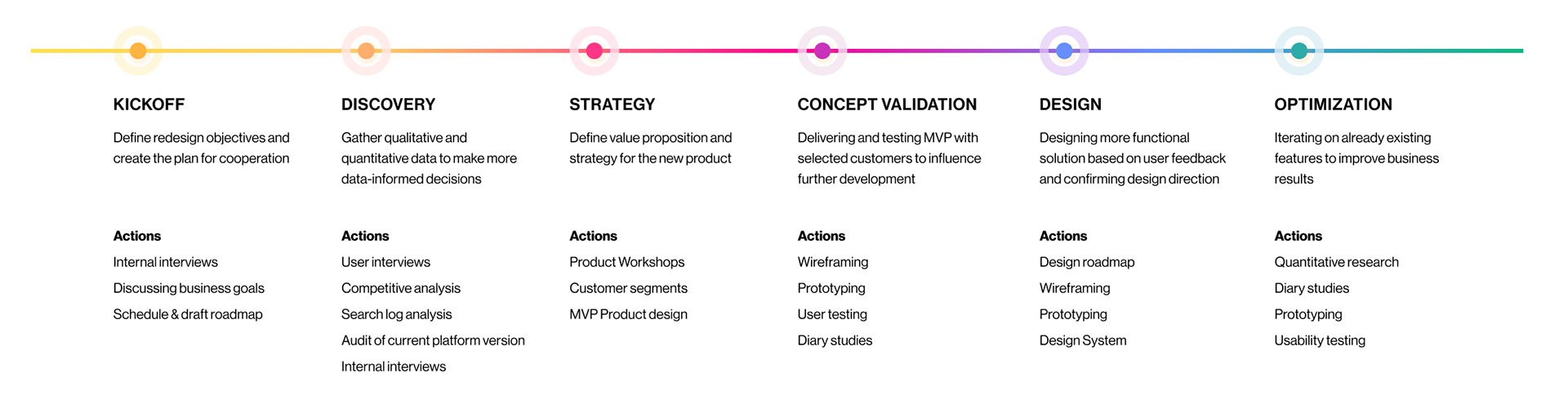
It was a long and challenging process, filled with UX activities!
The world of instructional designers
Videos as an essential part of digital learning
With the rise of YouTube and TikTok, teaching approaches are evolving, affecting also educators who now need to incorporate more dynamic resources to keep students engaged. Instructional designers play a key role in this shift. They carefully curate videos from various sources or create custom content tailored to learning goals. Think of them as the professor's right hand - staying up to date with the latest teaching methods and advising on how to present material in both informative and enjoyable way. They also design activities and assignments that align closely with the learning objectives and chosen video content.
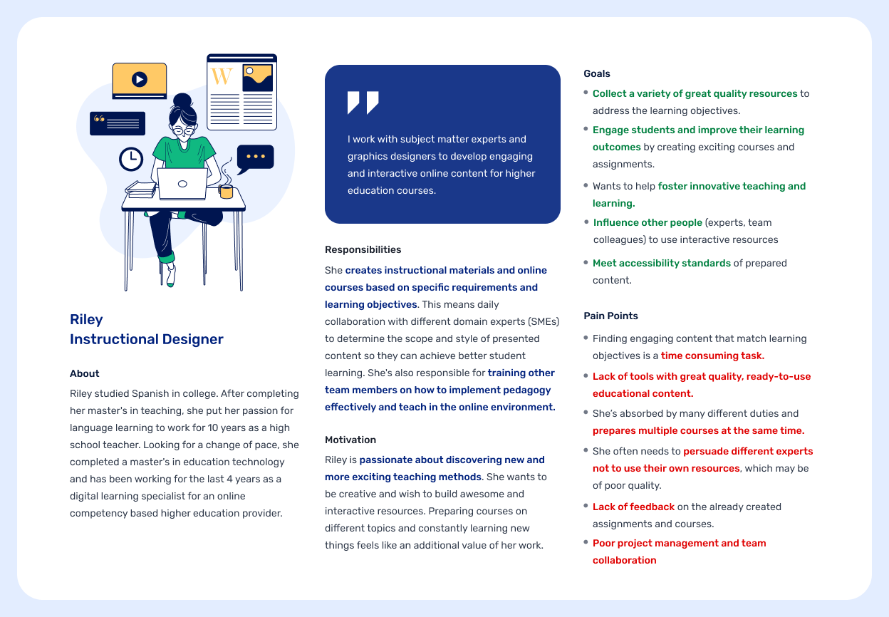
Meet Riley, our main user persona
Why redesign was critical?
"I was a little disappointed by what we found here. When you’re describing the platform it sounds really great but in reality, it’s difficult to find what you want, or even if you do then it’s from a super-pricey provider - what is it, “The School of Life”?"
The main goal of Boclips library is to simplify finding, embedding, and licensing high-quality educational videos for courses. However, the initial version of the app was disappointing to our users — and frankly, to everyone in the company. Quickly built on an outdated stock platform template, it couldn't showcase the best content and was difficult to sell. Moreover, we had very limited insights into user's workflow and search expectations. The first part of the redesign involved interviewing the sales team, internal experts, and external end-users. This helped us better understand their work, internal processes, and the pain points they faced while sourcing additional course content or demonstrating our platform.
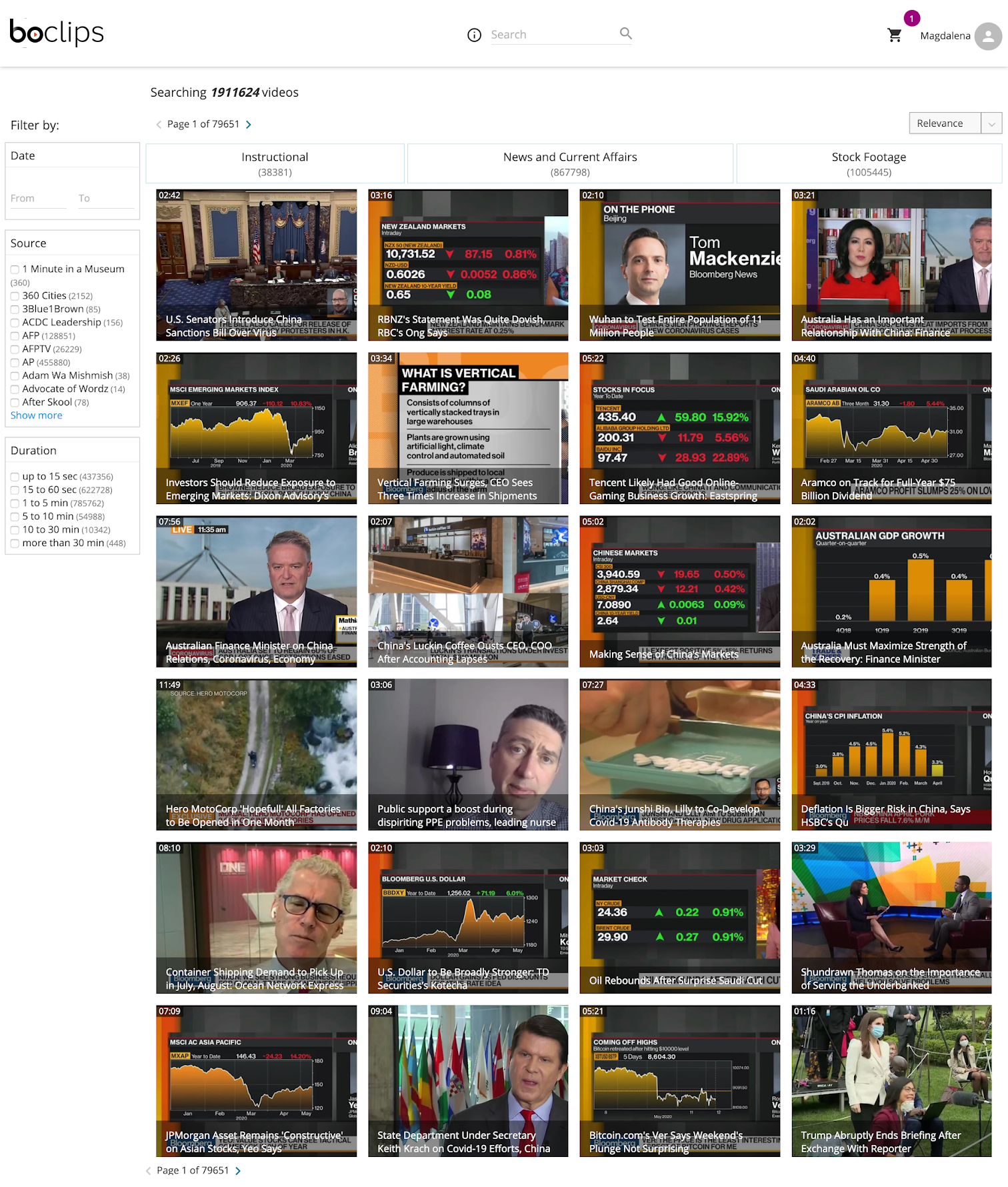
Old B2B platform version with a discouraging amount of low-quality results
It's impossible to quickly find relevant videos
The library was meant to be a convenient, time-saving tool but most users found it frustrating to use. To find anything, they had to rely solely on search, which often returned an overwhelming number of irrelevant results. The lack of browsing or discovery options was one of the the biggest pain points. Users also expressed disappointment with the lack of guidance & how to use our videos effectively. As a result, the platform felt more like a generic stock video site than serious educational resource. This was especially disheartening, as users had a genuine need to expand the use of video content in their courses but the platform simply wasn't supporting that goal.
"I get a lot of what look like amateur videos. I was looking for something professional, whereas there were a lot of interviews on the red carpet etc. with terrible quality. Part of using that platform is knowing the sources"
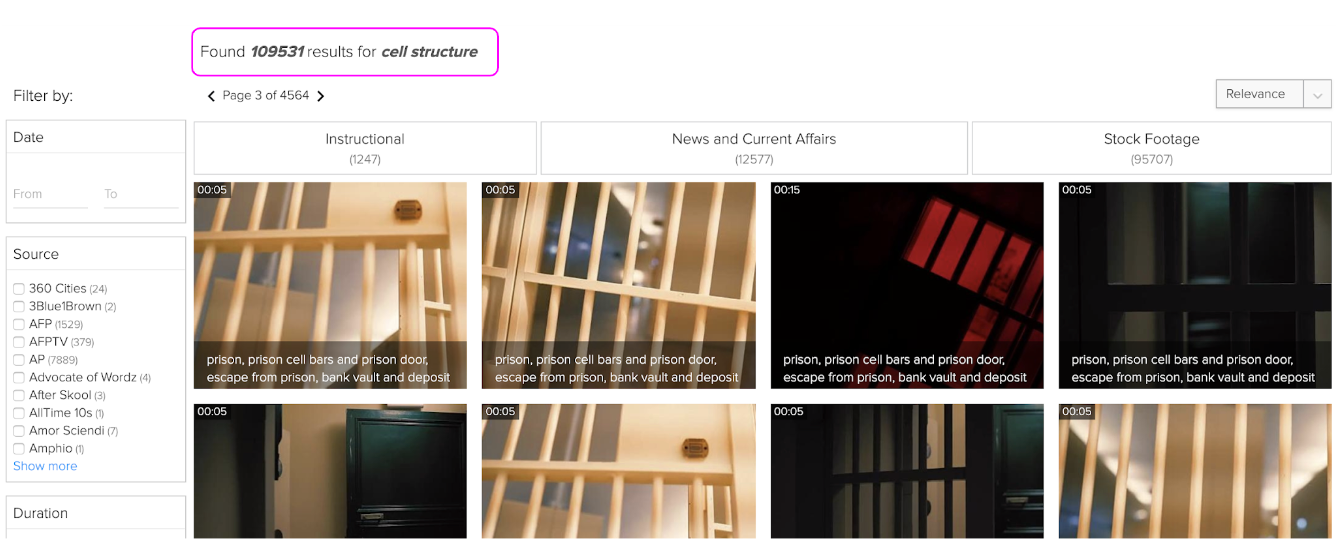
One of my favorite spotted examples of irrelevant search results. The number of videos was overwhelming and definitely not showcasing educational value (as stock video content was prioritized on the platform..)
Course creation is a team effort
While Instructional Designers take the lead in searching for additional resources, they need to collaborate closely with subject matter experts and project managers — to align on content selection and confirm the course budget. At the time, the only way to share videos was by sending individual links via Slack or compiling them into multiple docs. For most users, this was a tedious and inefficient process, especially when compared to more modern platforms that offer built-in collaboration features.
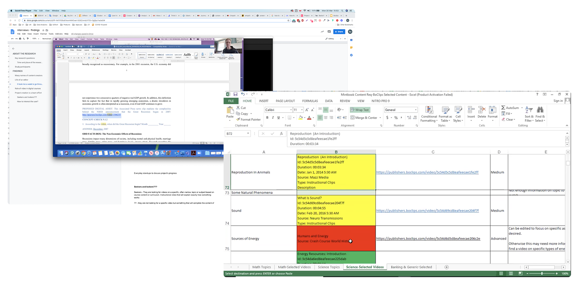
During the interviews, Instructional Designers shared with us sample documents where they keep links to all promising resources and guided us through their decision-making process. At the same time, our sales team relied heavily on spreadsheets to showcase our content capabilities to potential customers. Definitely not an XXI-century experience :)
Defining strategy and scope
The discovery phase helped us clearly define the project scope. In addition to conducting interviews, we also analyzed data and search query patterns to uncover recurring user needs and behaviors. With these insights in hand, I initiated a conversation with leadership and sales team about how we could better optimize the value we deliver.
Due to Covid lockdown, I facilitated our first round of strategy workshops entirely remotely. I broke down the activities into smaller groups and set aside daily time for the whole team to come together, discuss the outcomes, and align on the next steps.
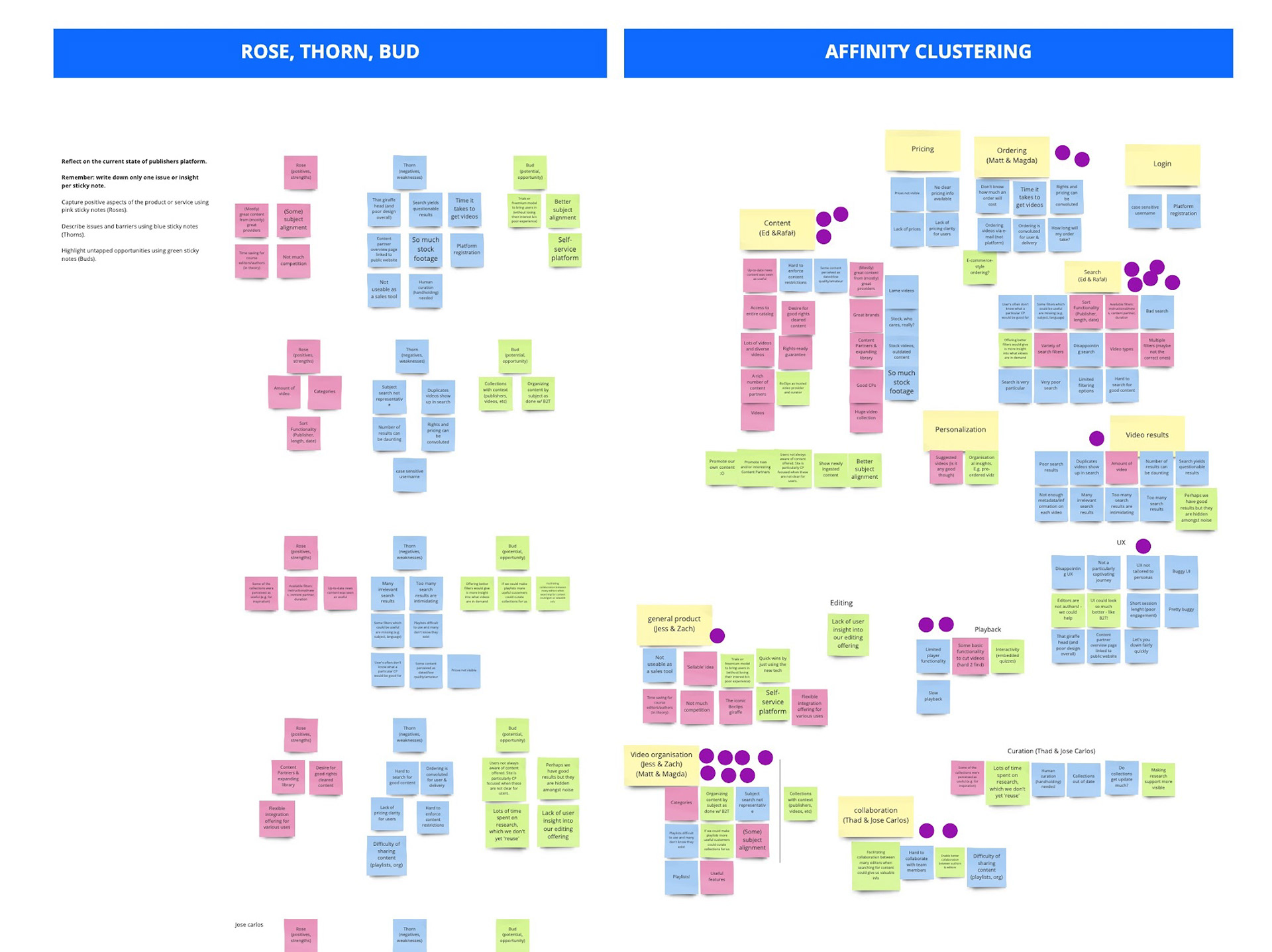
We spent a lot of time discussing the most pressing problems and prioritizing ideas. Storyboarding and sketching were also vital and for the 1st time reviewed on cameras!
Reimagining educational library
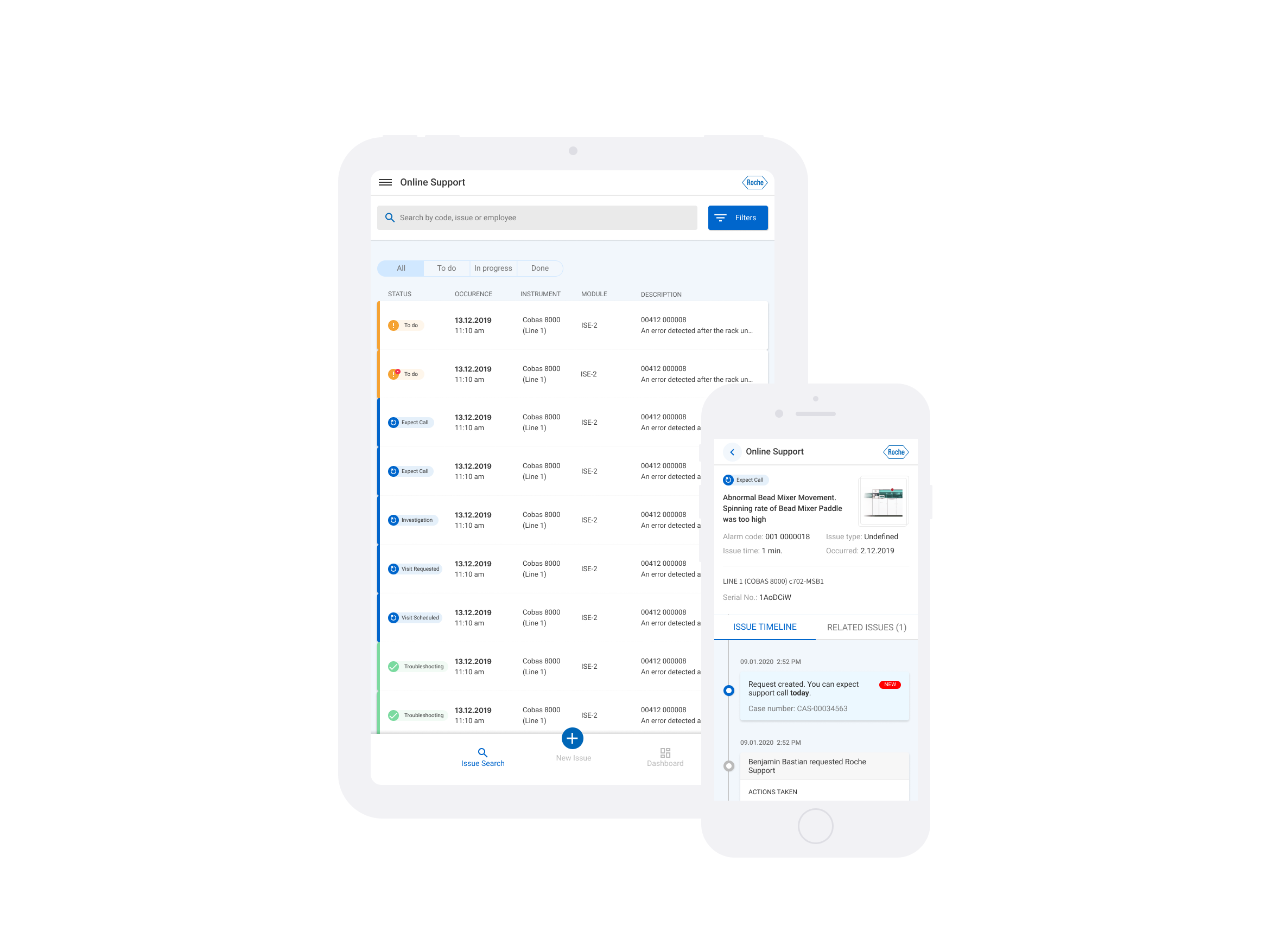
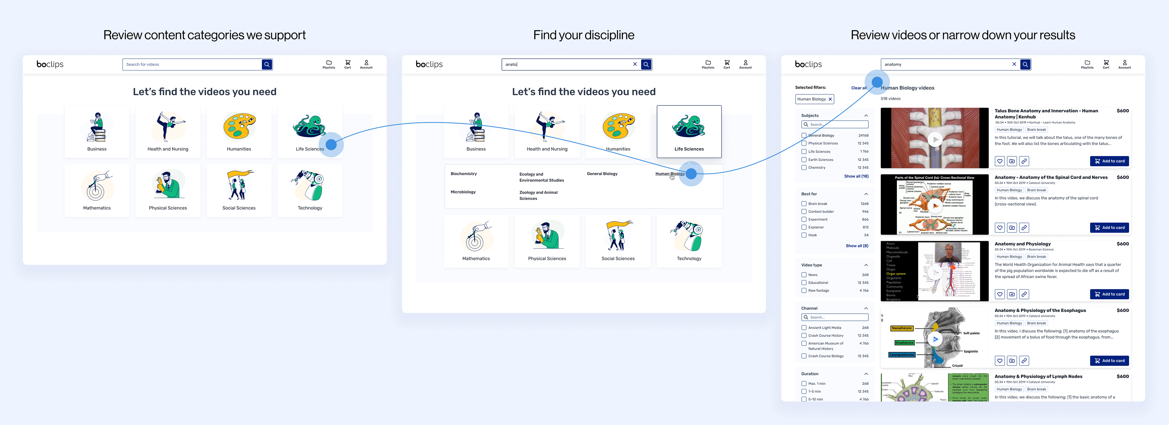
Home screen and new search layout
During the MVP phase, we made only minimal changes to the home screen — focusing mainly on implementing best practices for search UX to improve usability and revelance.
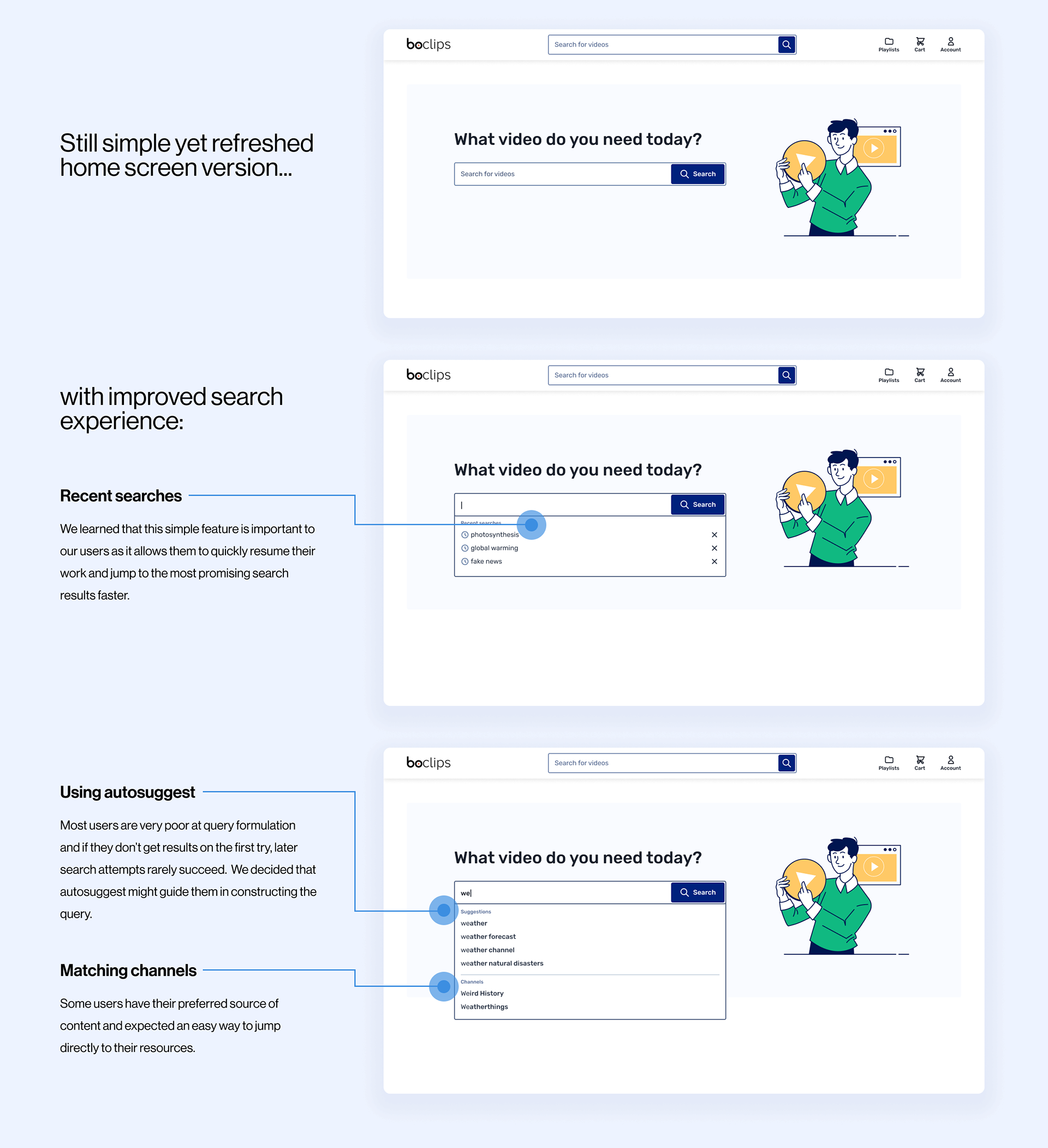
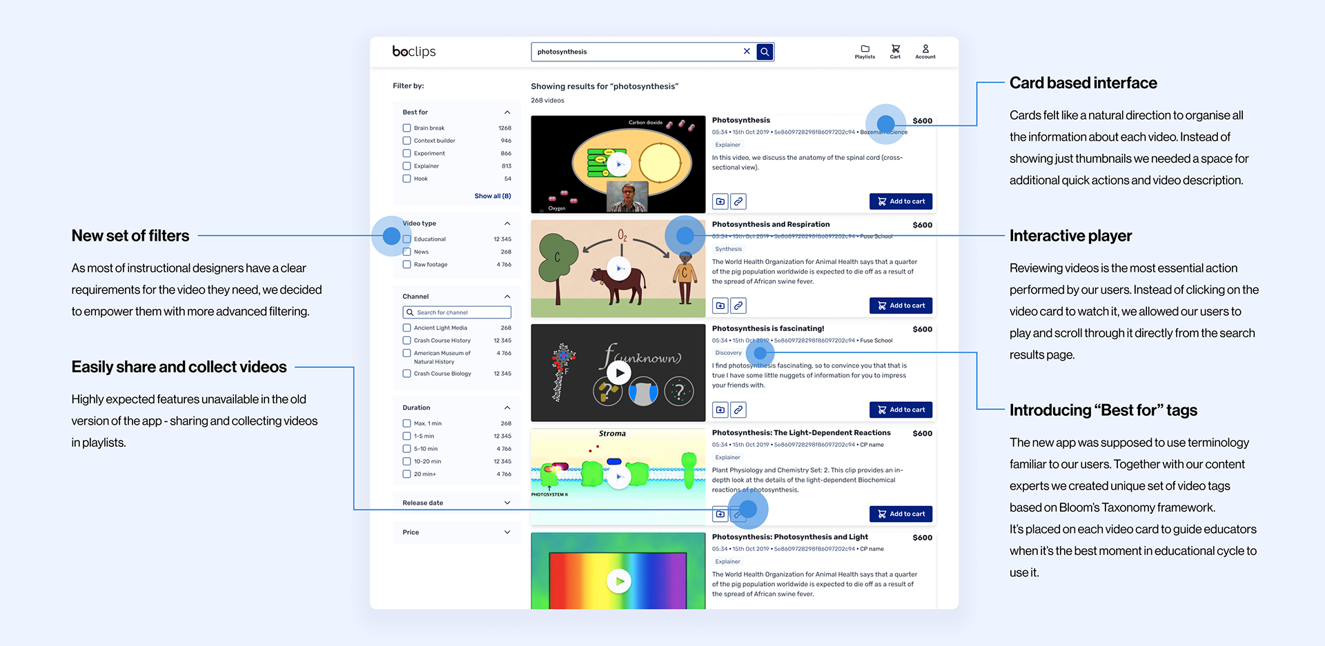
The search results page deserved the most critical rethinking & redesign:
Iterating on the search experience
Regular user testing and monitoring of search metrics form the foundation for moving beyond the MVP stage. While the new simplified UI and updated search results page were seen as more modern and user-friendly, they didn't significantly improve search success. Through user interviews, diary studies, and collaboration with taxonomy experts, we decided to introduce a new custom content categorization system. Our goal was to make it easier for users to browse videos, discover relevant material, and gain inspiration for future courses.
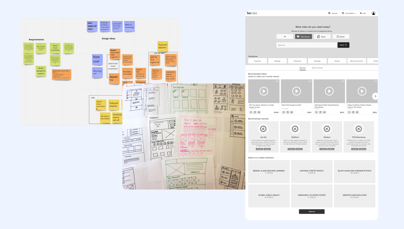
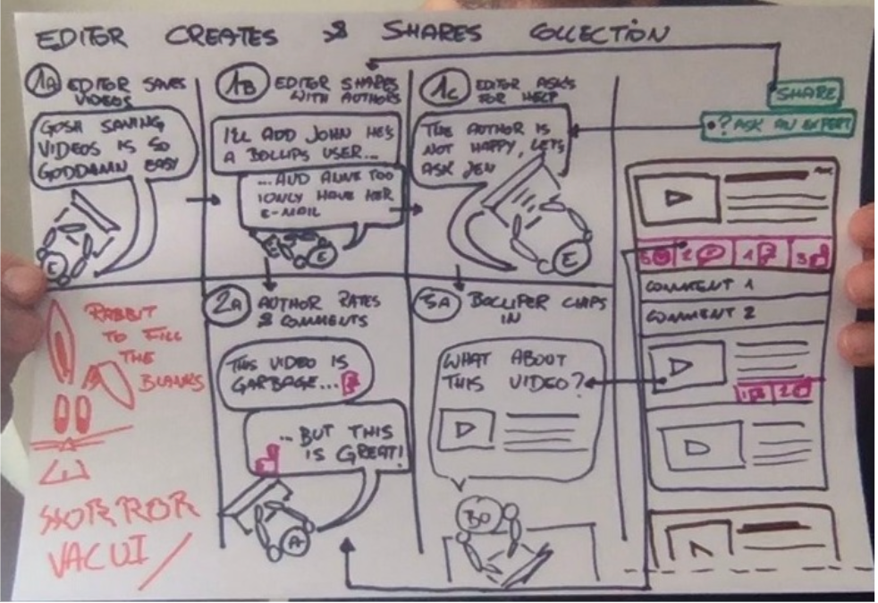
We often organize various brainstorming and sketching sessions at Boclips. Our dev team especially like them because they can share their own ideas and make an impact. I turn the most promising ideas into prototypes that could be later tested with users.
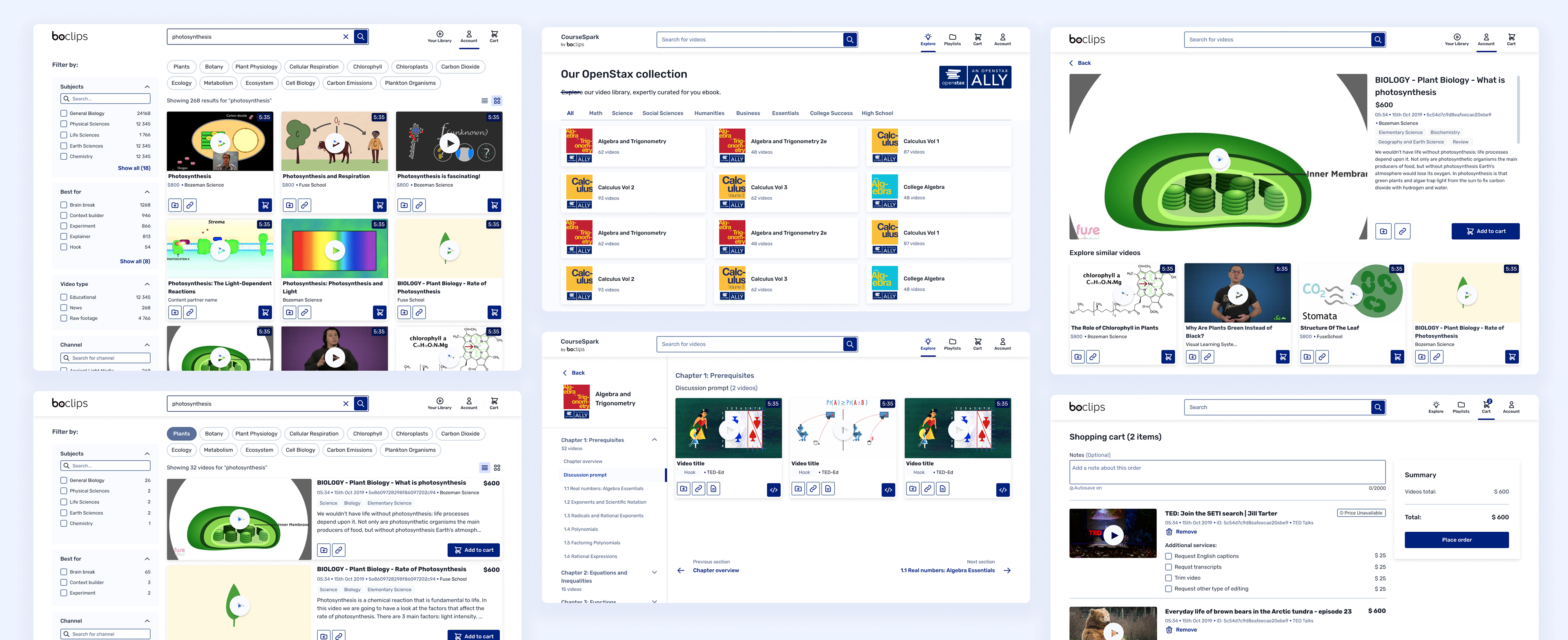
A first developed version of flow & UI for new Subjects navigation.
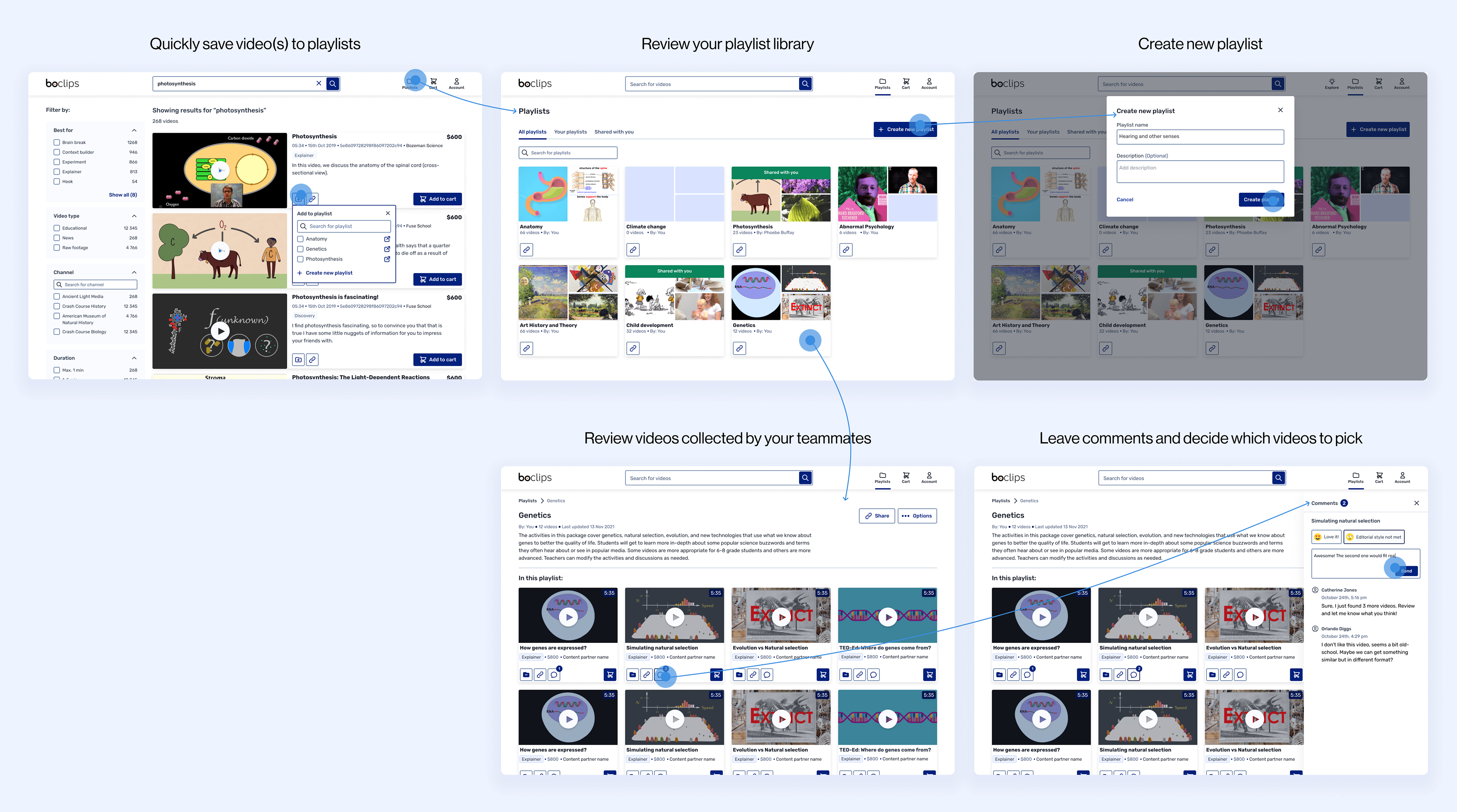
Smooth collaboration with playlists
"Sometimes I research videos at night and watch them in the morning. I would then take a long look when I have time and see if they’re useful. If I could share the playlist with my writing partner that would also be really useful"
From the start of the project, we knew we needed a space for team collaboration — where instructional designers could gather videos, invite collaborators, and make content decisions together. At the same time, our sales team and internal experts needed a flexible way to create curated collections that could easily be shared with prospects. This seemingly small and simple feature had a bit impact. It not only supported collaborative workflows but also significantly improved product adoption and positively influenced the sales process.
Introducing BoSystem
As part of our redesign efforts, we also established a single source of truth for all interactive components - a proper Design System. Together with another designer, I spent 3 weeks transforming our MVP style guide into a comprehensive component library. We ensured that all the elements were accessible and that the entire app met WCAG 2.1 compliance standards. Our goal was to create a functional system that would speed up the design process while fostering a shared design language across the company. The results extended beyond product: the marketing and sales teams were able to align their decks and materials to match the product's updated look and feel. "BoSystem" even became part of the internal vocabulary at Boclips - a sign of how well it took root.
Have a look at our Design System!
Thanks to the Design System I was able to quickly update all the components and easily maintain app consistency
Taking care of qualitative data
using a research repository
using a research repository
Throughout the redesign project, we conducted numerous user sessions and diary studies. At first, we collected interview notes in shared docs, run affinity mapping in Miro, and documented research findings in slide deck or the company wiki... It quickly became overwhelming - not just for me, but for the whole team. Analyzing qualitative data was exhausting and we often felt like we were missing valuable insights from past studies.
After testing several research repository tools, I decided to implement Dovetail as a centralized space to document and organize all types of qualitative research. We moved away from taking live notes during interviews and instead focused on tagging transcript based on a consistent taxonomy. At the end of each research round, I summarized key insights in short blog posts which were reviewed not only by our product team but also by sales. Everyone wanted to stay close to the user voice, and getting access to the latest insights had never been easier. What I especially appreciate about Dovetail is how it breaks original videos into smaller chunks - so when someone reads my synthesis they can also watch exact user clip behind it. It brought a new level of transparency and trust to our research process.
Easily digestible research findings in the form of short blog posts
Reflections
Redesigning our main B2B application was a long and challenging journey. It took nearly 12 months to deliver the first simple version of the product. I'm really proud of the impact I had throughout the project, especially as our research findings were regularly used to inform and shape the roadmap. Thanks to the new design and features we were also able to win over several large customers who were both satisfied and impressed with the improved experience. Looking back, I do wish we invested more time early on in exploring more creative and innovative search patterns. That said, I'm glad we had the opportunity to experiment and iterate further in the later stages of the project.